
e-commerce | mobile app case study
The Candle Corner Mobile App
overview
I conducted interviews and created empathy maps to understand the users I’m designing for and their needs. A primary user group identified through research included working and retired adults who like the convenience of shopping online.
This user group confirmed initial assumptions about the Candle Corner customers, but research also revealed that it is very important to users that there are transparent reviews and descriptions, as well as a simplified interface so shopping is more efficient and less stressful.
design/tool stack


at a glance
-
A retail app for a maker where users can shop candles.
-
January 2022 - March 2022 (Revised in 2025)
-
UX/UI Designer creating an app for the Candle Corner from conception to delivery
-
Conducting interviews, paper and digital wireframing, low and high-fidelity prototyping, conducting usability studies, accounting for accessibility, and iterating on designs.
usability study findings
I conducted monitored usability studies with five people between the ages of 25 and 65. Each person had a different background in experience with shopping online and provided a variety of insights to help improve the Candle Corner App.
Round 1 findings
Cart page needs to be easier to find and navigate through from adding an item to the cart to completing the check out process.
Browse page is overwhelming with an excess amount of text. Overall it needs to be simplified.
The first page should be the Home Page, where the user can choose if they either want to continue as a guest or create an account at any point throughout their journey through the app.
Round 2 findings
Colors need to be more accessible so buttons and important text such as headers are easier to read, especially for users with disabilities.
Add a ‘sort by’ feature next to the ‘filter by’ feature on the Browse page so the user can decide in what order they would like to view products.
Add a bubble feature to the cart icon that tells you how many items you have in your cart
Pain Points

user persona
kristi, 30
Senior Marketing Specialist | MBA
Des Moines, IA
“I’m a 30-year-old homebody who’d rather shop online to be with my dogs than other humans.”
Meet Kristi, an avid online shopper with a passion for supporting small businesses. Kristi's discerning taste extends to her love for scented candles, and she is on the lookout for a candle shopping app that aligns with her preferences. Easy navigation and detailed product descriptions are paramount for Kristi, as she values a seamless shopping experience and wants to ensure that the candles she purchases match their descriptions accurately. Kristi seeks an app that not only supports her shopping needs but also resonates with her commitment to empowering small businesses through her purchasing choices.
accessibility considerations
Accessibility considerations were a crucial prioritization throughout the project to ensure that the Candle Corner App is usable and inclusive for all users, including those with disabilities. Here are some key accessibility considerations that were at the forefront of the process:
-
Sufficient color contrast between text and background to make content readable for users with visual impairments.
Avoid heavy usage of color to convey important information; use additional cues such as icons or text labels.
-
Use readable fonts and provided options for users to adjust text size without compromising the overall design.
Avoid using text in images, as screen readers may not be able to interpret them.
-
Provide clear and concise instructions for form fields and validate input to assist users in completing forms.
Use accessible input types and labels to make forms more user-friendly.
-
Maintain a consistent layout and navigation structure throughout the application to assist users in understanding the interface.
Clearly label sections and headings to aid in navigation.
Information Architecture

-
Have a full overview of what is offered on the site and have it easy for the user to choose where they would like to navigate to next, whether that is a specific item, to sign up for an account, or to add a few items to their favorites list.
-
Help the users get as much information as possible without needing to click to other pages. Information that is required on this page is the name of the product, the price, the ability to quickly ‘like’ the item to add to their favorites list in their profile, and potentially a way to immediately add an item to their cart without opening the individual item’s page.
-
Give the user more information on a specific product, including the product name, the price, a description, and customer reviews.
-
Item descriptionAdding an item to the cart can happen from multiple areas, including the home page, browse page, favorites, and of course the product page.
-
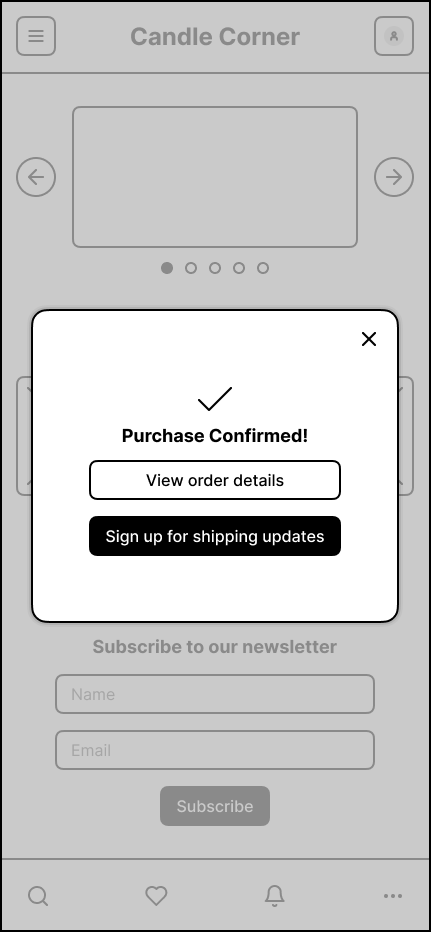
Make the checkout process simple, streamlined, and not overwhelming. Could potentially lean toward utilizing a progress indicator component if it is necessary.
Wireframes

Digital Wireframes
-
![]()
Sign In Page
-
![]()
home page
-
![]()
Menu
-
![]()
Search feature
-
![]()
shop page
-
![]()
item listing
-
![]()
item added to cart
-
![]()
cart
-
![]()
payment info
-
![]()
payment info - billing address
-
![]()
shipping info
-
![]()
place order
-
![]()
confirmation modal page


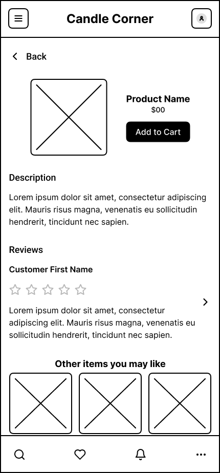
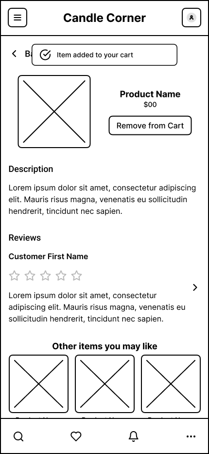


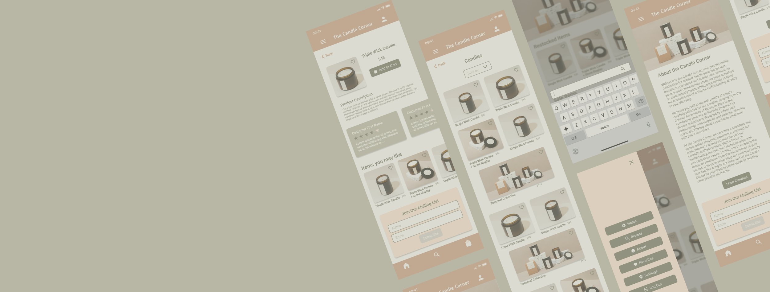
Mockups
-
![]()
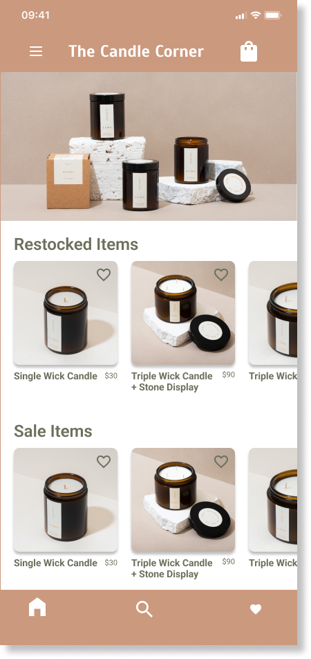
Home Page
-
![]()
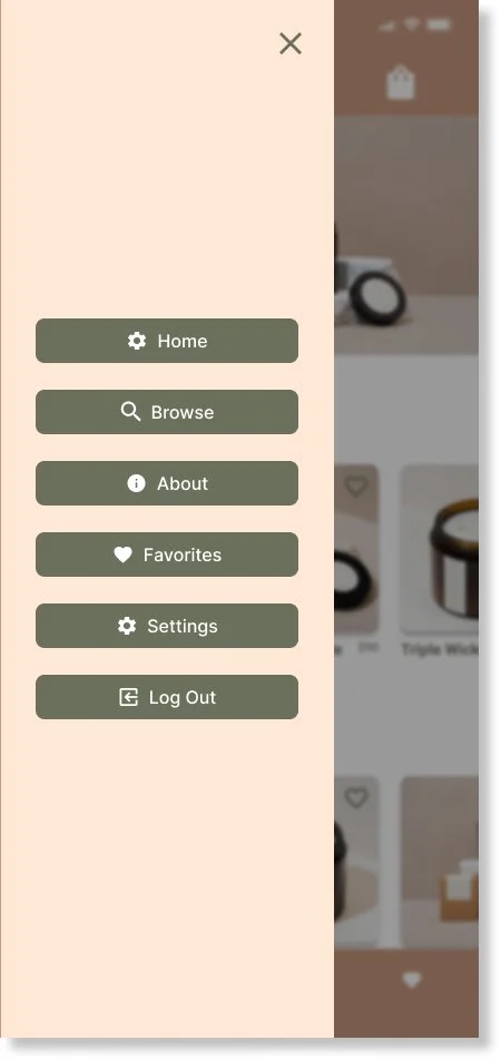
Navigation
-
![]()
Browse
-
![]()
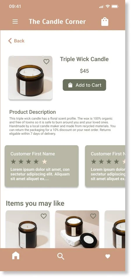
Item Page
-
![]()
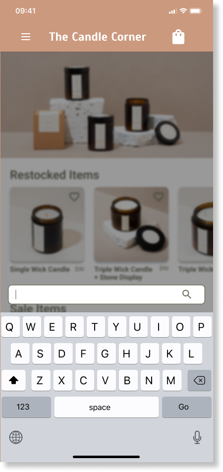
Search Functionality
-
![]()
Favorites Page
-
![]()
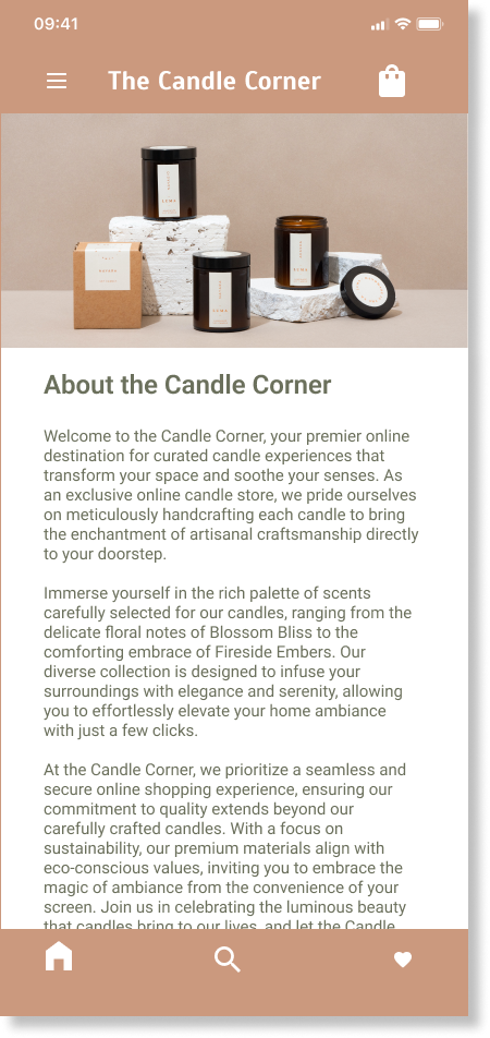
About Page


Usability Testing & Findings
colors
The colors throughout the platform were refined to be more accessible across the app, including call to actions and forms.
filtering options
Filtering options were added to improve the experience of searching and sorting through products.
Hi-fi Prototype


Component Library / UI kit
impact
The app makes users feel like the Candle Corner really strives to meet their needs. One quote from participant feedback: "This is exactly what I would expect from a modern app."
what i learned
While designing the Candle Corner App, I learned that the first ideas of the app are just the beginning of the design process. Usability studies and peer feedback kept improving the app during each iteration.
Key Takeaways
Conduct another round of usability studies to validate whether the pain points users experienced have effectively been addressed.
Conduct more user research to determine any new areas of need. Iterate on designs and user flows to improve the user’s overall experience with the Candle Corner App.
Next Steps
let’s connect!
Get in touch with me at tjvannart@gmail.com, or simply submit a message through the form.