TJ Vann Art Branding
About
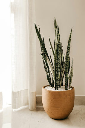
TJ Vann Art is a brand that blends creativity with nature, capturing the warmth and richness of earth tones. Inspired by the organic beauty of plants and the timeless appeal of terra cotta, the brand’s aesthetic reflects a deep connection to the natural world. The logo, built around the initials TJV, represents both artistic identity and personal expression, making each piece a reflection of authenticity and passion.
Branding Colors


Logo + variations
Default - Spanish Orange

Secondary - Monstera Green

Tertiary - Kraft Paper

Favicons


Mood Board

Image by Ivana Cajina

Image by Hannah Busing

Image by Svetlana Sinitsyna

Image by Amelia Protiva

Image by Jonathan Borba

Image by Juan Gomez

Image by Andrej Lisakov
Mission Statement
At TJ Vann, we believe in the beauty of intentional living—where creativity, comfort, and self-expression come together. Through art, home aesthetics, and mindful routines, we inspire others to create spaces that feel like home, embrace their creative passions, and find joy in everyday moments.
Personal & Relatable Tone of Voice
I share my creative journey, making it feel authentic and approachable. The tone blends cozy aesthetics, creativity, and intentional living while feeling genuine and engaging.
More coming soon…
let’s connect!
Get in touch with me at tjvannart@gmail.com, or simply submit a message through the form.
