
e-commerce | Website & app case study
Sammie’s Sandwich order & Delivery

Overview
I conducted interviews and created empathy maps to understand the users I’m designing for and their needs. A primary user group identified through research included working professionals who like the convenience of ordering their food ahead of time and tracking their order’s progress.
This user group confirmed initial assumptions about the Sammie’s customers, but research also revealed that it is very important to users that there is a way to choose specialty items, as well as customize their sandwich order.
design/tool stack


at a glance
-
A sandwich ordering website for users to order for pickup and delivery
-
March 2022 - April 2022 (Revised in 2025)
-
UX designer creating a website and mobile app for Sammie’s from conception to delivery.
-
Conducting user interviews, paper and digital wireframing, low and high-fidelity prototyping, conducting usability studies, accounting for accessibility, iterating on designs, and responsive web design.
Research & Discovery
From the start of the project, my main goal was to understand the customer—who they are, what they need, and where they might run into frustrations. The research and discovery phase was key to this. I conducted a competitive audit to see what was already out there, created customer personas to define our key users, and mapped out user journeys to understand their experience from start to finish. All of this helped shape the foundation for the design decisions moving forward.
Competitive audit
To kick off the research, I conducted a competitive audit to see what similar platforms were doing well and where there were gaps we could improve on. I looked at things like first impressions, overall usability, key features, accessibility, and how intuitive the navigation felt. I also paid close attention to visual design and brand identity, as well as the tone and clarity of content. This gave me a solid understanding of what was working, what wasn’t, and how we could create a better, more user-friendly experience.

user persona
Sarah, 40
Library Media Center Director | Multiple Master’s Degrees
Chicagoland Area
“Time is limited and valuable, so when ordering food for my family it is important to track it on it’s way to my house.”
Sarah is a Library Media Center Director at a K-5 school. When she is at home spending time with her family, she likes to have meals as streamlined as possible. So when she orders food online, it is important that she is able to see how long delivery will take, track the order’s trip to her house as well as possibly schedule the delivery to arrive at a time that is most convenient for her schedule.
User journey map
Mapping Sarah’s journey revealed how helpful it would be for users to have access to order progress details.

Pain Points
sitemap
Creating a sitemap helped me jump start the design process and organize how the Sammie’s Website would be structured.

User flows
Creating user flows helped me determine the best route for users to take throughout the platform.

Wireframes & lo-fi Prototypes

Desktop wireframes
-
![]()
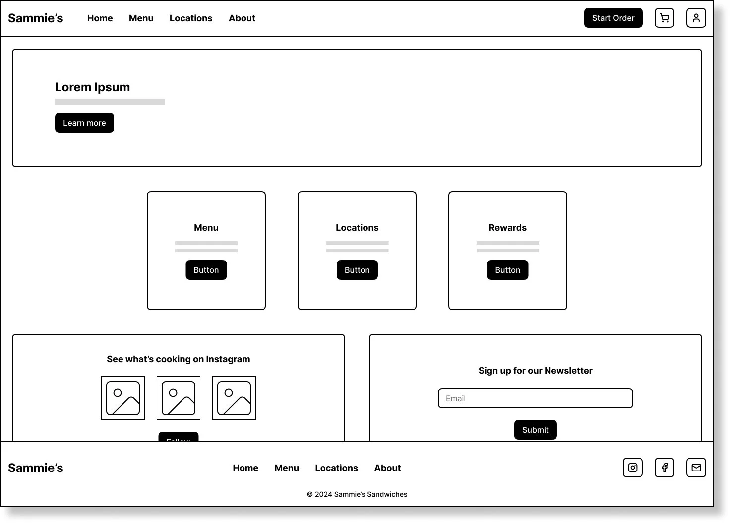
Home Page
-
![]()
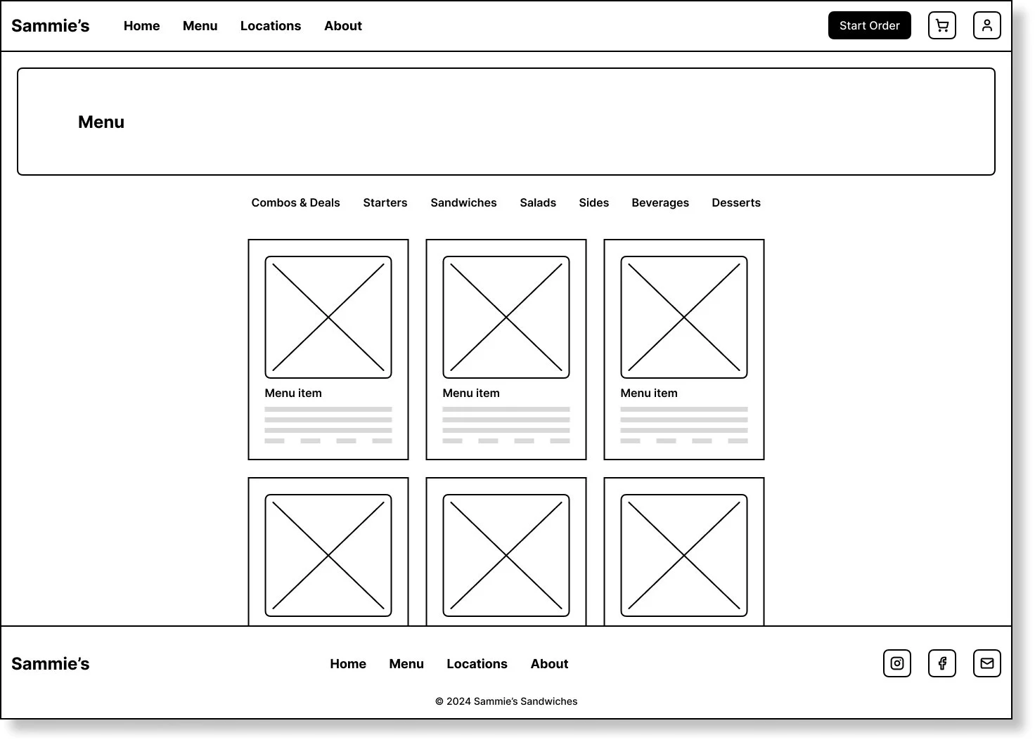
Menu page
-
![]()
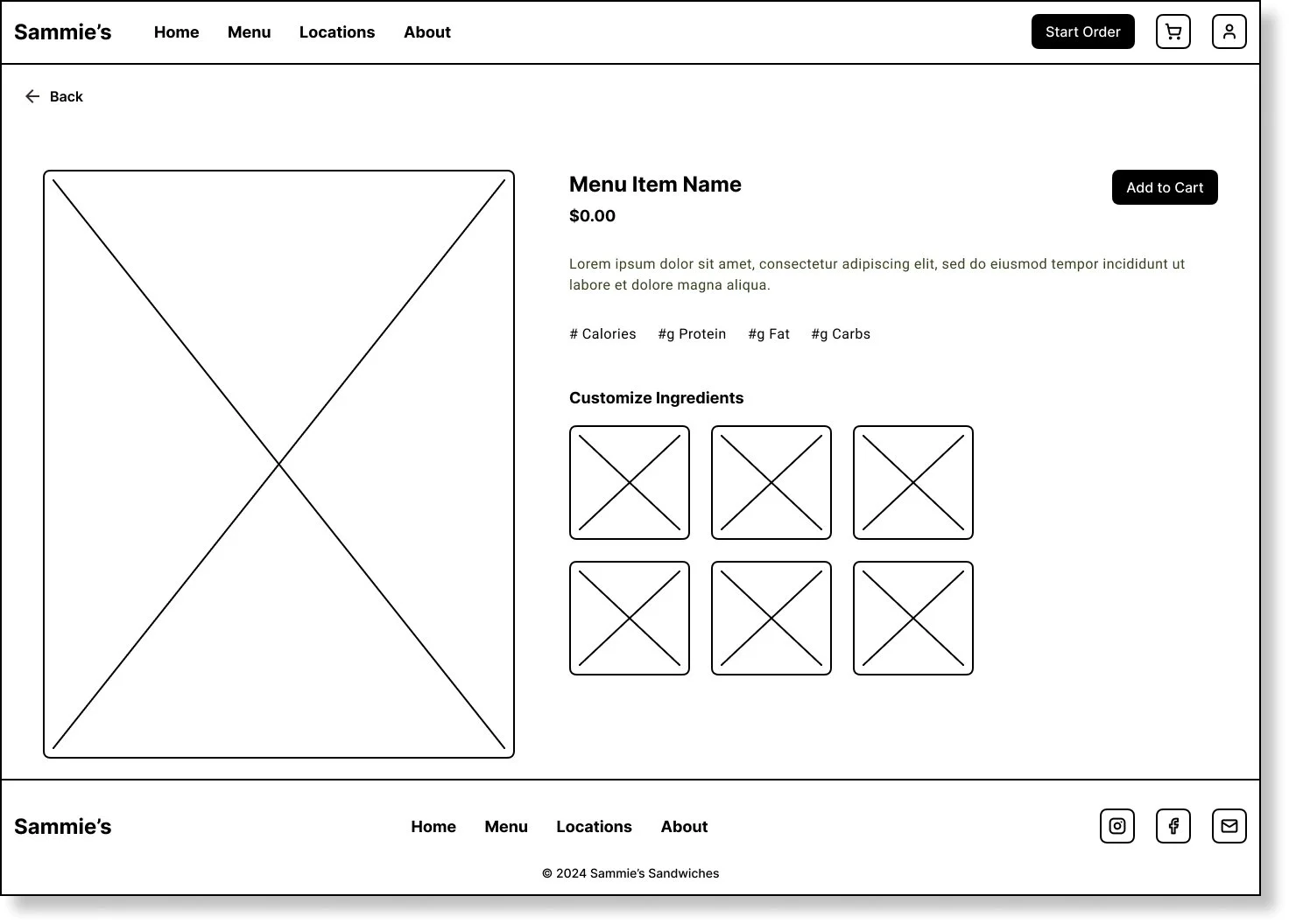
Menu Item Page
-
![]()
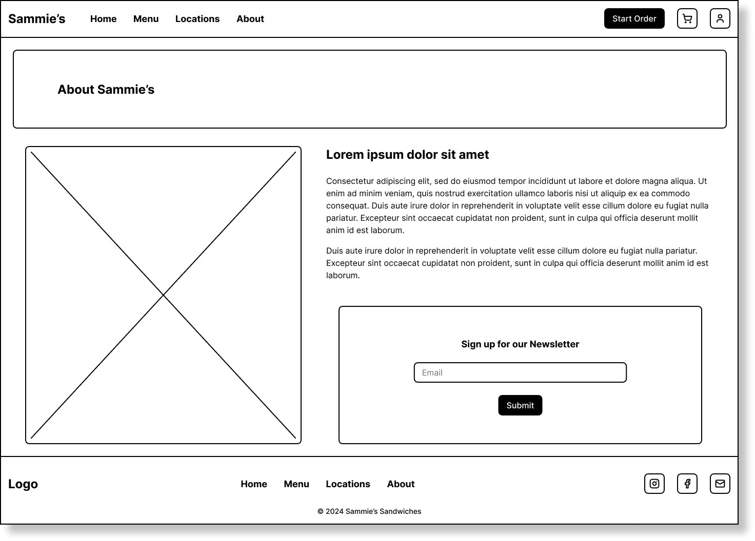
About Page
-
![]()
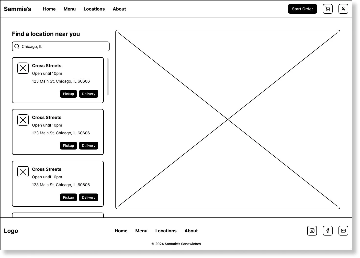
Location Page - Empty State
-
![]()
Locations Page - filled state
Mobile wireframes
-
![]()
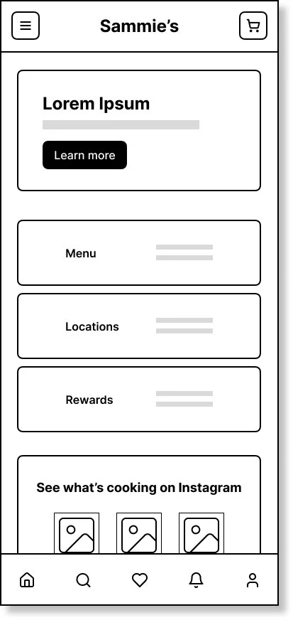
Home Page
-
![]()
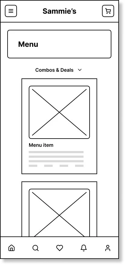
Menu page
-
![]()
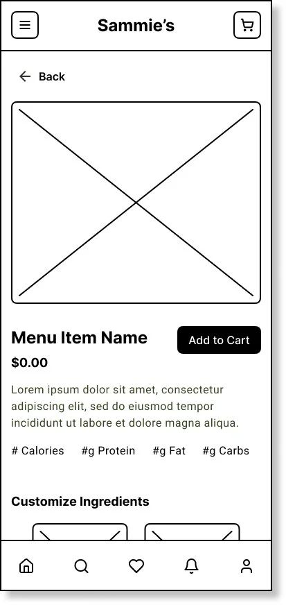
Menu Item Page
-
![]()
About Page
-
![]()
Location Page - Empty State
-
![]()
Locations Page - filled state
-
![]()
Locations Drawer


lo-fi desktop prototype

lo-fi mobile prototype


Usability study findings
I conducted monitored usability studies with five people between the ages of 25 and 65. Each person had a different background in experience with ordering food online and provided a variety of insights to help improve Sammie’s.
round 1 findings
Cart page needs to be easier to navigate to
The first page should be the Home Page, not a login page
round 2 findings
Colors need to be more accessible
Add a feature to the cart icon that tells you how many items you have in your cart
hi-fi mockups & Prototypes
Desktop Mockups
-
![]()
Home Page
-
![]()
Menu page
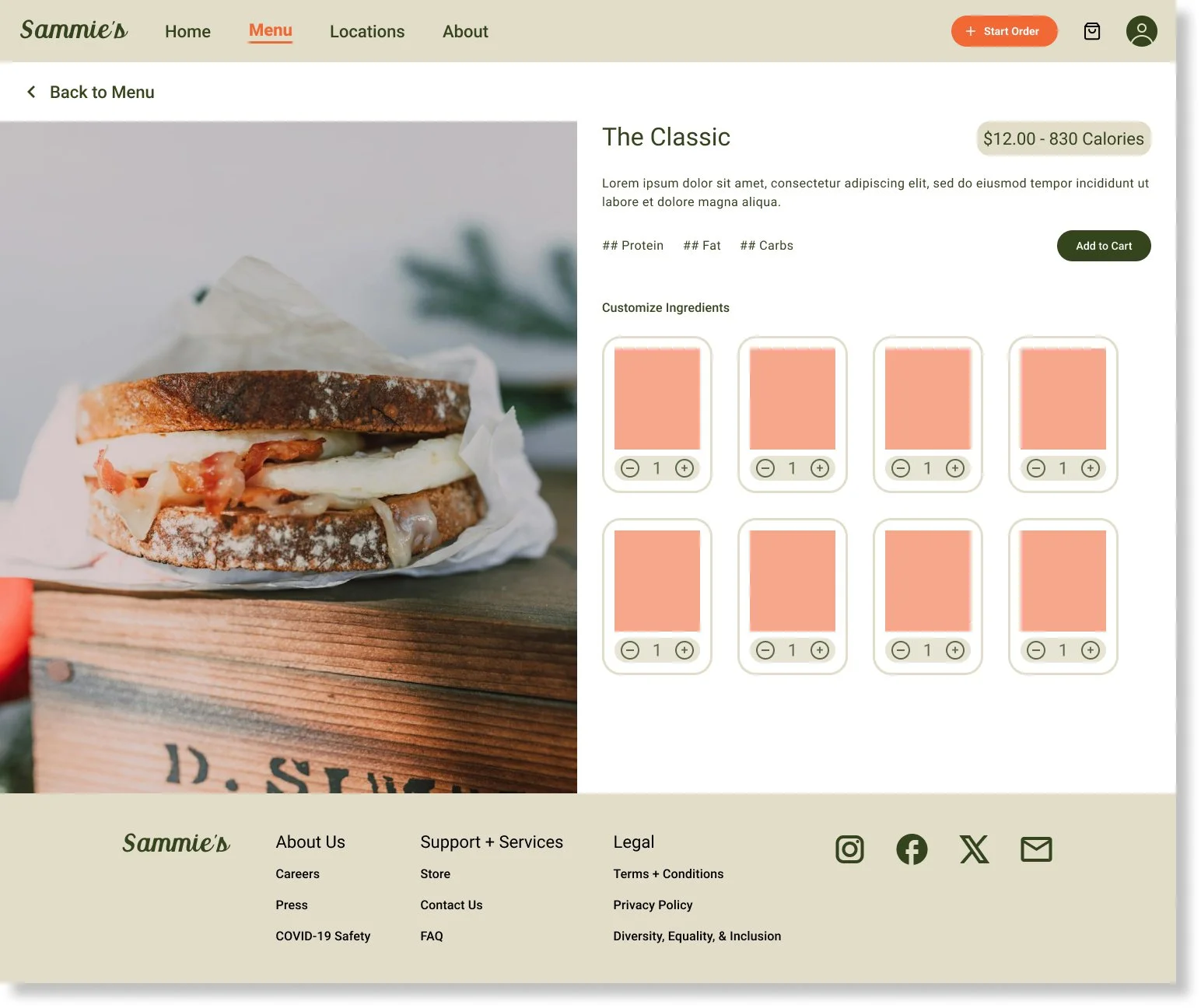
-
![]()
Menu Item Page
-
![]()
Location Page - Empty State
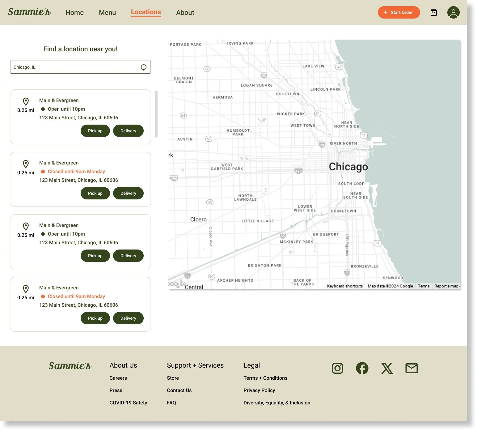
-
![]()
Locations Page - filled state
-
![]()
Order confirmation page


Mobile Mockups
-
![]()
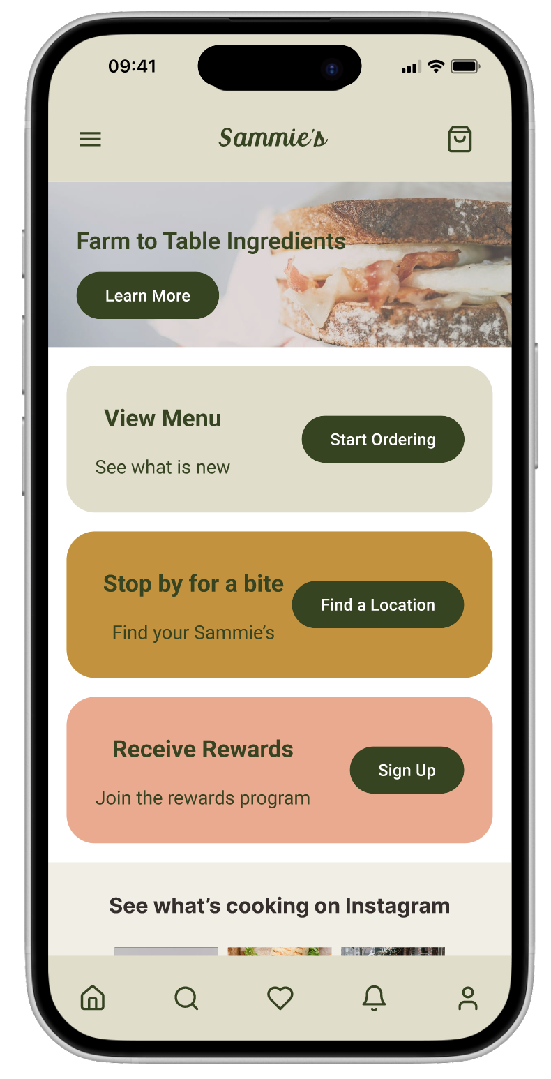
Home Page
-
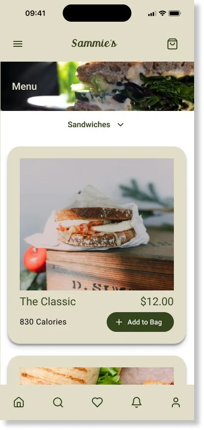
![]()
Menu page
-
![]()
Menu Item Page
-
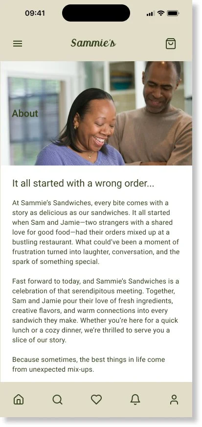
![]()
About Page
-
![]()
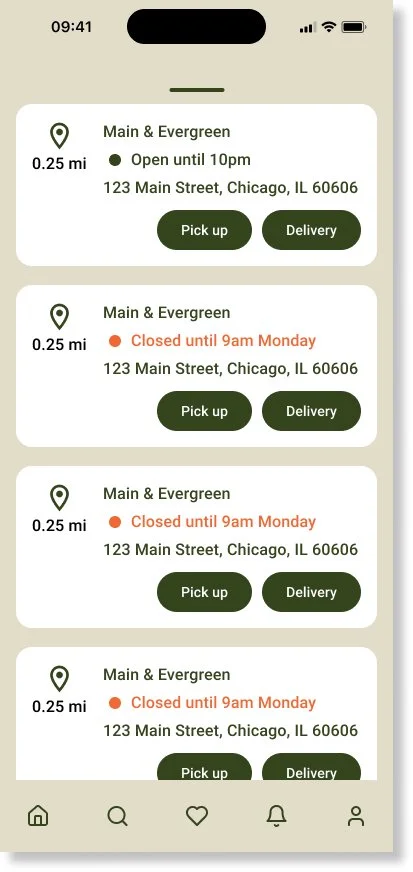
Location - Empty state
-
![]()
Location - filled state
-
![]()
Location - drawer expanded


Before usability testing and iterations
-
![]()
Home Page
-
![]()
Delivery
-
![]()
track order


hi-fi desktop prototype

hi-fi mobile prototype


UI kit

accessibility considerations
Colors
The colors of the buttons were updated to meet accessibility requirements
Order review page
The order review page was simplified and condensed all onto one page to make the checkout process more efficient.
takeaways
What I learned
While designing the Sammie’s Sandwiches platform, I learned that the first ideas of the app are just the beginning of the design process. Usability studies and peer feedback helped the app improve during each iteration cycle.
The Impact
Conduct more user research to determine any new areas of need.
Next steps
Usability Studies
Conduct another round of usability studies to validate whether the pain points users experienced have effectively been addressed.
User Research
Conduct more user research to determine any new areas of need.
let’s connect!
Get in touch with me at tjvannart@gmail.com, or simply submit a message through the form.